Transforming Small Business Branding
Branding & Identity // Qoola
The Canadian economy was changing drastically and small businesses like Qoola Frozen Yogurt needed to stay competitive. Working in collaboration with teams in Canada and the Philippines, I spearheaded a brand transformation to create Qoola Fresh.
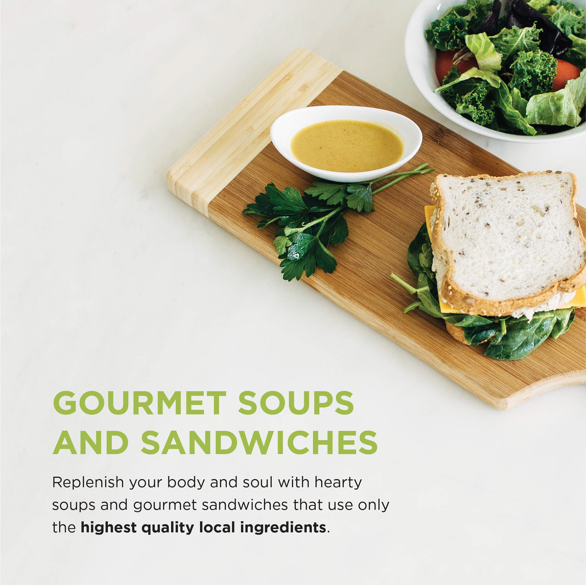
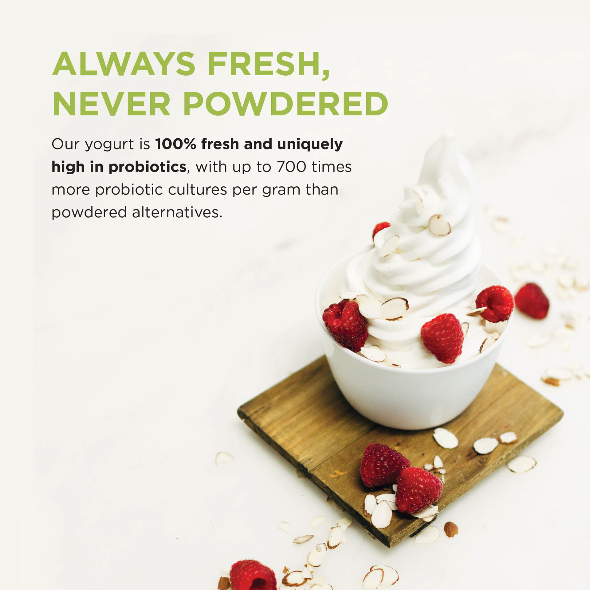
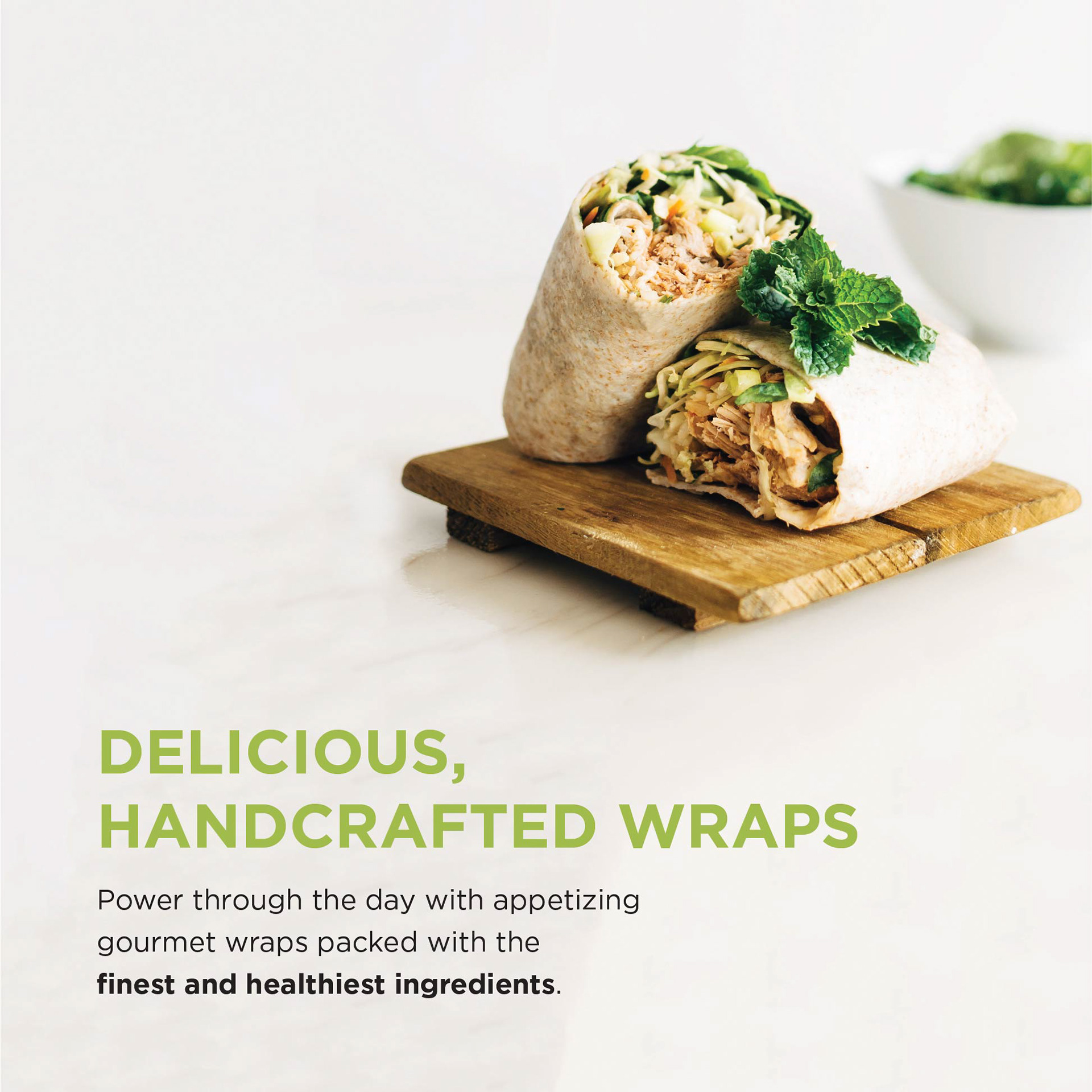
Photographer: Tracy Moromisato; Photography Direction: Elysia Chu, Nathan Watkins
Background
Qoola is a self-serve fresh frozen yogurt company founded in 2008 in Vancouver, Canada. In 2016, a new concept called Qoola Fresh was born, offering a more extensive menu beyond frozen yogurt which includes healthy entrées, desserts, sandwiches. As part of this new chapter for Qoola, I crafted a new brand and identity for the company.
Qoola is a self-serve fresh frozen yogurt company founded in 2008 in Vancouver, Canada. In 2016, a new concept called Qoola Fresh was born, offering a more extensive menu beyond frozen yogurt which includes healthy entrées, desserts, sandwiches. As part of this new chapter for Qoola, I crafted a new brand and identity for the company.
Contributions
I played the role of brand development and design lead. I worked with a Vancouver-based team consisting of a videographer, graphic designer, and photographer, and a Manila-based team consisting of a project manager, graphic designer, and a development team. I contributed to the following areas:
- Research: brand ideation and development
- Design: ideation, mockups, defining color palette, typography, photography style, brand book assets, and more
- Implementation: provided design guidance to remote Philippines team during the development of the website to ensure successful implementation and design adherence
- Mentorship: provided mentorship to designers in Canada and Philippines team
Final Deliverables
1. Website redesign
2. Brand book including but not limited to:
- Logo and its applications
- Colors and typography
- Photography style / Mood board
- Copy and tone of voice
- Icons
- Colors and typography
- Photography style / Mood board
- Copy and tone of voice
- Icons
3. Marketing material for store opening
My Process
Research
I spent some time better understanding Qoola's market positioning and overall brand. I also did extensive research on frozen yogurt brands across North America to get a better picture of how Qoola Fresh would fit into the landscape. Below is a snapshot of some original Qoola branding material I studied.
I spent some time better understanding Qoola's market positioning and overall brand. I also did extensive research on frozen yogurt brands across North America to get a better picture of how Qoola Fresh would fit into the landscape. Below is a snapshot of some original Qoola branding material I studied.
Original Qoola branding material
Some of the top frozen yogurt chains / healthy cafés in North America
Brainstorm
I started out by doing some light brainstorming to get to the core of what the company stands for. I knew that Qoola had an established customer base that could naturally become that of Qoola Fresh's. I also recognized the importance of preserving the integrity of the original Qoola logo to ensure brand recognition of Qoola Fresh.
I started out by doing some light brainstorming to get to the core of what the company stands for. I knew that Qoola had an established customer base that could naturally become that of Qoola Fresh's. I also recognized the importance of preserving the integrity of the original Qoola logo to ensure brand recognition of Qoola Fresh.
Present & Iterate
As soon as I landed on any solid concept proposal, I presented it to the team in Canada via Google Hangouts to get their feedback. I knew that the people who truly understood the company and its culture best were the core Qoola team staff themselves so I proactively involved them in the ideation and creation of Qoola Fresh.
Regularly Connect with Team
I had weekly calls with the team in Canada and the Philippines to update them on any progress and to go into design critiques with them. Doing this regularly ensured that everyone was on the same page when the new brand book was created.
Logo, Colors, Typeface
The logo represents a fruit and stands for Qoola’s commitment to freshness. I took the essence of the original logo and simplified it to make it bolder and more recognizable. I also chose colors that are slightly more muted than the original but still in keeping with the initial theme. I decided on a sans serif typeface that is bold and clean to give the brand a distinct presence.
Brand Applications
To get the teams familiarized with how to use the new brand guidelines, I put together various examples of finished design applications as part of the brand book.
Sample Menu Design


Sample In-Store Marketing Material
Sample Nutrition Profile Design
Designs Produced
These are some of the designs the team produced based on my brand guidelines.
Mail Out Flyer for Store Opening Promotion
Food Truck Design
Website Banner
Store Photos
Below are photos of the new Qoola Fresh store.


